
Accessible PDFs Part 2: How to Write Alt Text
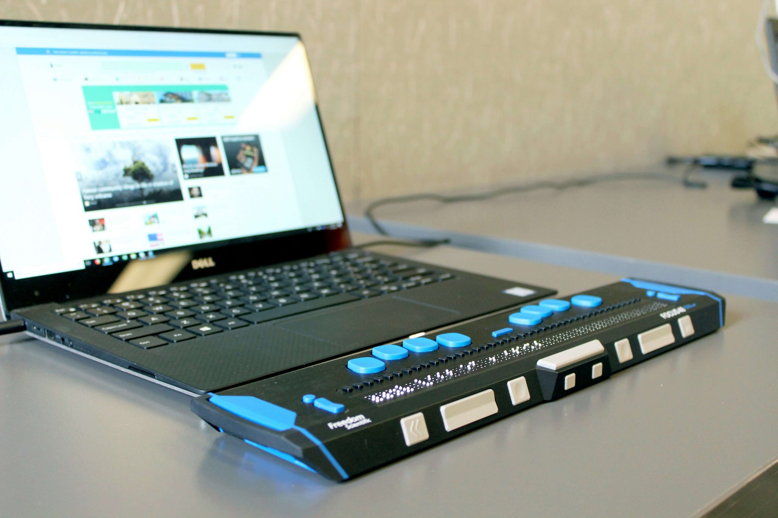
Alt text, short for alternative text, gives people using assistive technologies a way to access visual content. Every essential image needs it, from photographs to data visualizations to logos. In the first article of the Accessible PDFs series, I covered the changing laws around electronic documents, how to prepare, and the additional content you’ll need to produce, including alt text.
During the report design process, we move through three phases: first, content development; second, design and layout; and third, finalize and publish. We develop alt text during the design and layout phase. In the design phase, we create or reformat graphics, and we select and place photos. If these items are set before design and layout, you can certainly begin writing sooner. Whenever we get to this point, The Bridge Studio will produce a document that inventories each item that requires alt text so it is easy for you to write, review, and edit. Here is guidance and best practices to consider.
Write alt text in plain language
Alt text should be written in plain language. The International Plain Language Federation (IPLF) defines plain language as follows: “A communication is in plain language if its wording, structure, and design are so clear that the intended readers can easily find what they need, understand what they find, and use that information.”
Plain language writing tips include:
- Know your audience: Plain language does not mean watering down your content; it means making it simple to understand for your target audience(s). That starts with asking, “Who is this product for and what are they trying to do with it?”
- Write in the active voice. Writing in the active voice makes your content more direct and succinct, and it often sounds more natural.
- Write in the positive, not the negative. Negative framing requires your reader to hold two ideas at the same time — what you want, in contrast to what you don’t want. For example, “Don’t go outside during a hurricane,” becomes “Stay indoors during a hurricane.”
- Write in short sentences and paragraphs. Shorter sentences and paragraphs are more inviting, easier to understand, and easier to skim.
Describe what’s in the image
Include only what sighted readers can see. Avoid interpreting the meaning of images. The image will be tagged, and assistive technology will tell the reader it’s an image. Your alt text can simply read, “A young woman sits…” not “Image of a young woman sitting…” To include “picture of…” or “image of…” is redundant.
Keep it short and sweet
One or two sentences is sufficient for most images. If your image is dense or has a lot of data, provide the necessary content so your reader understands the full meaning behind the image. Keep in mind that while there is no standard rule, most guidance suggests alt text be concise.
Use explanatory text
When alt text is not enough to describe an image, consider adding explanatory text in the body of your document or as a caption.
Use punctuation
Write alt text as complete sentences and include periods. This tells the assistive technology to pause before continuing on to the next item.
Alt text for charts, graphs, and figures
Here is a simple formula to use when writing alt text for figures: [Chart Type] of [Variables/Axes], showing [Key Trend or Takeaway]. For figures with dense, multi-series charts, alt text is not meant to replace the underlying data. For anything too complex to summarize in a few sentences, the image may need a linked data table or longer description elsewhere.
Check out this article on the official Section 508 website for more guidance on writing alt text for figures and a deeper dive on alt text in general.
Don’t trust AI-generated alt text
On the Adobe InDesign Community forum, users report extremely offensive content produced by the AI-powered alt text generator that was released in early 2026. While this feature is enabled by default, it can (and should) be disabled. This is a good lesson for us all to lean on the AI tenet of “keeping a human in the loop,” which reminds us that a human should always review content produced by AI.
For more information about Adobe InDesign’s AI-powered alt text troubles, check out this article produced by Creative Pro.
The Bridge Studio is here to help
If you have any questions you would like us to cover in the Accessible PDF series, or if you’d like to discuss your next design project, feel free to contact us.